JCP Consultancy International Limited - Website Revamp
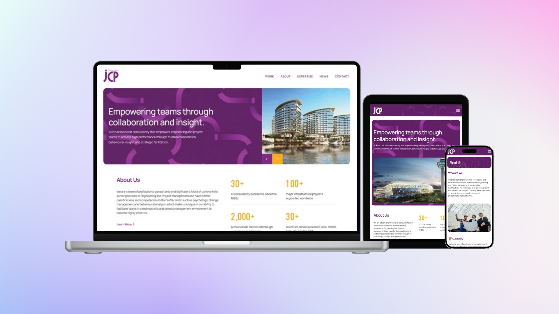
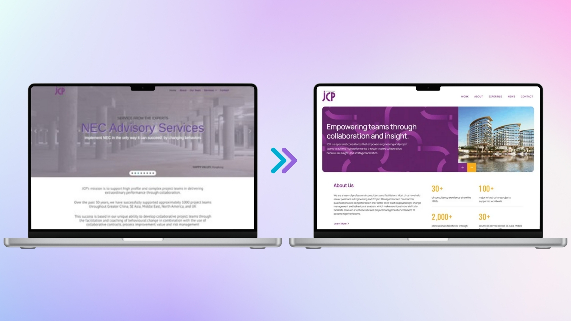
Challenge
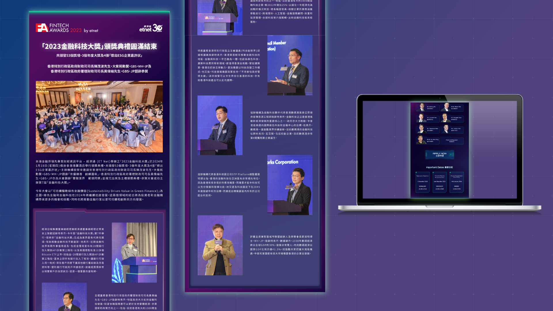
The original website lacked visual hierarchy and failed to communicate JCP’s unique positioning and collaborative philosophy. The dense blocks of text and outdated layout posed challenges for user engagement, especially for first-time visitors unfamiliar with value methodology or collaborative contracting. A key challenge was distilling decades of professional expertise into digestible, audience-friendly content while preserving the company’s depth and professionalism.
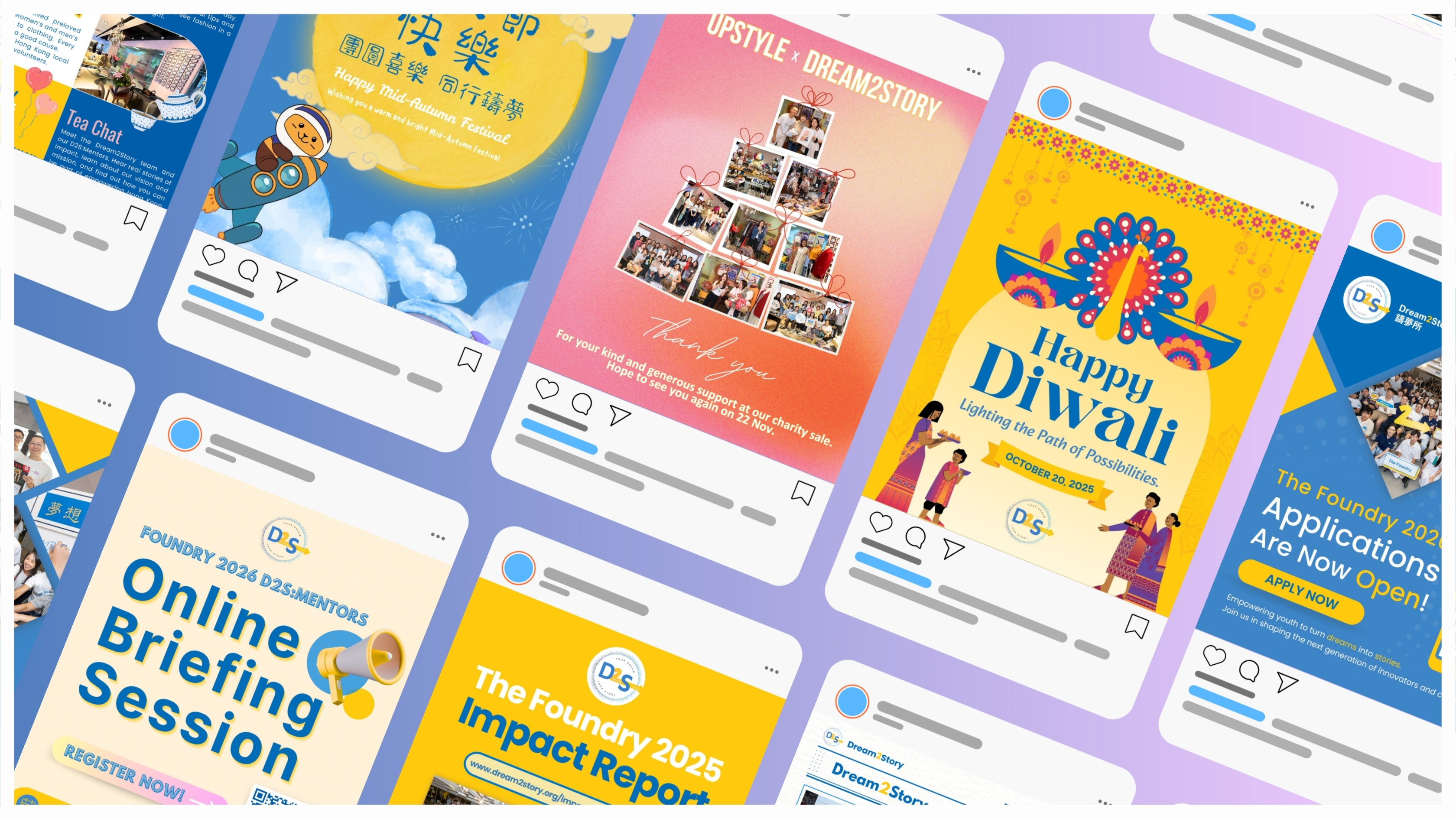
Social Media Strategy & Content Creation
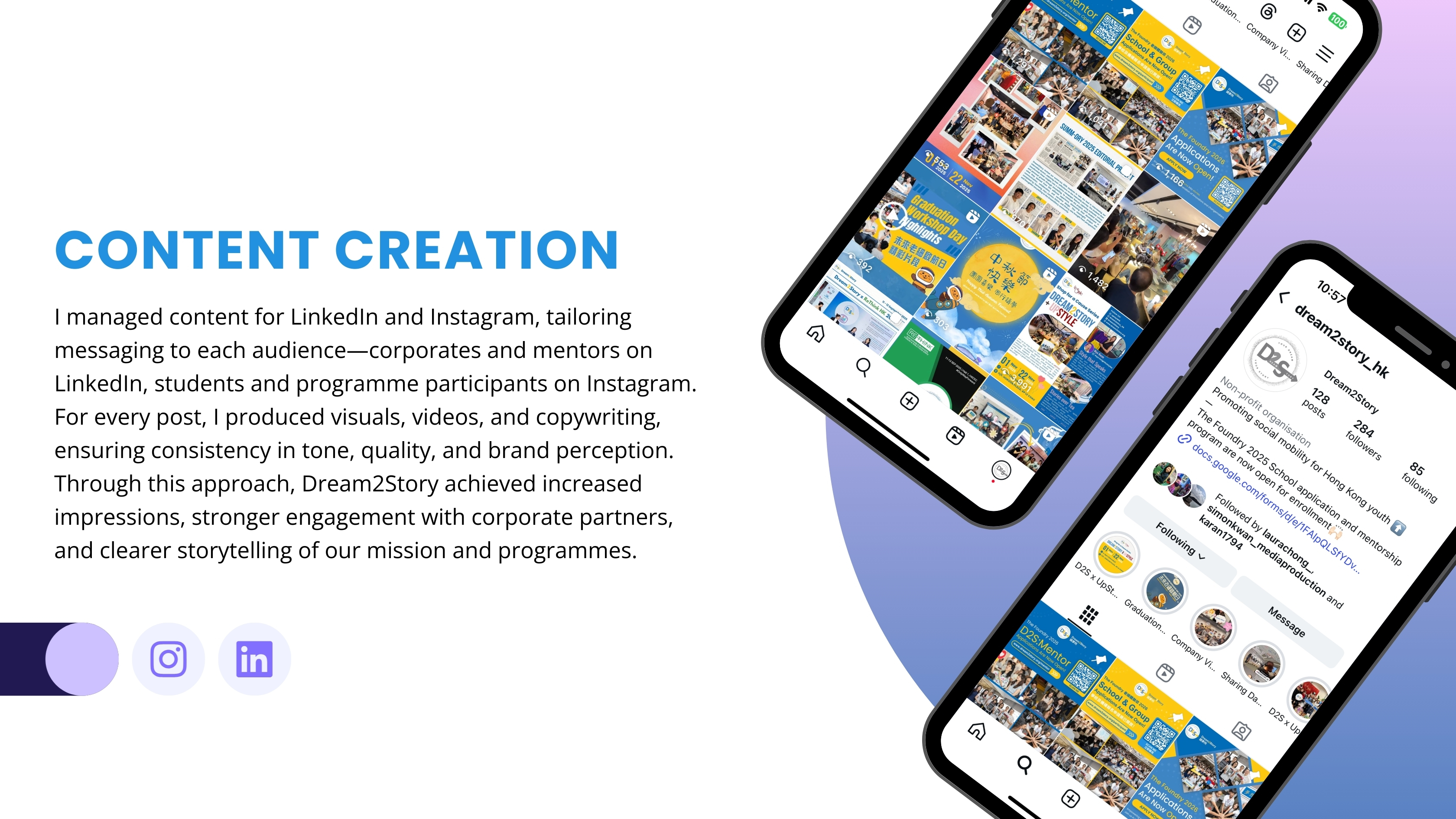
My role began with restructuring Dream2Story’s social presence from a scattered posting approach into a strategic communication system. I created a 12-pillar content framework designed to balance programme promotion, mentor engagement, youth inspiration, impact stories, and partnership highlights. Based on this structure, I developed monthly content calendars to align planning, execution, and performance review.
Website Revamp & Digital Storytelling
One of the major transformation projects was the redesign of the Dream2Story website. The previous website lacked mobile responsiveness, clear navigation, and compelling storytelling. I redesigned the full interface with a brighter, more youthful tone, reorganised information architecture, and improved user flow.
The new website communicates our NGO’s mission more effectively while making it easier for different audiences to find what they need. Students can navigate programme details more intuitively, while mentors and partners can complete applications through dedicated call-to-action pathways. Content restructuring helped increase clarity and improved SEO visibility. By presenting stronger narratives and visuals, the website now better supports conversion goals, credibility, and donation initiatives.
Event Identity & Programme Collaterals

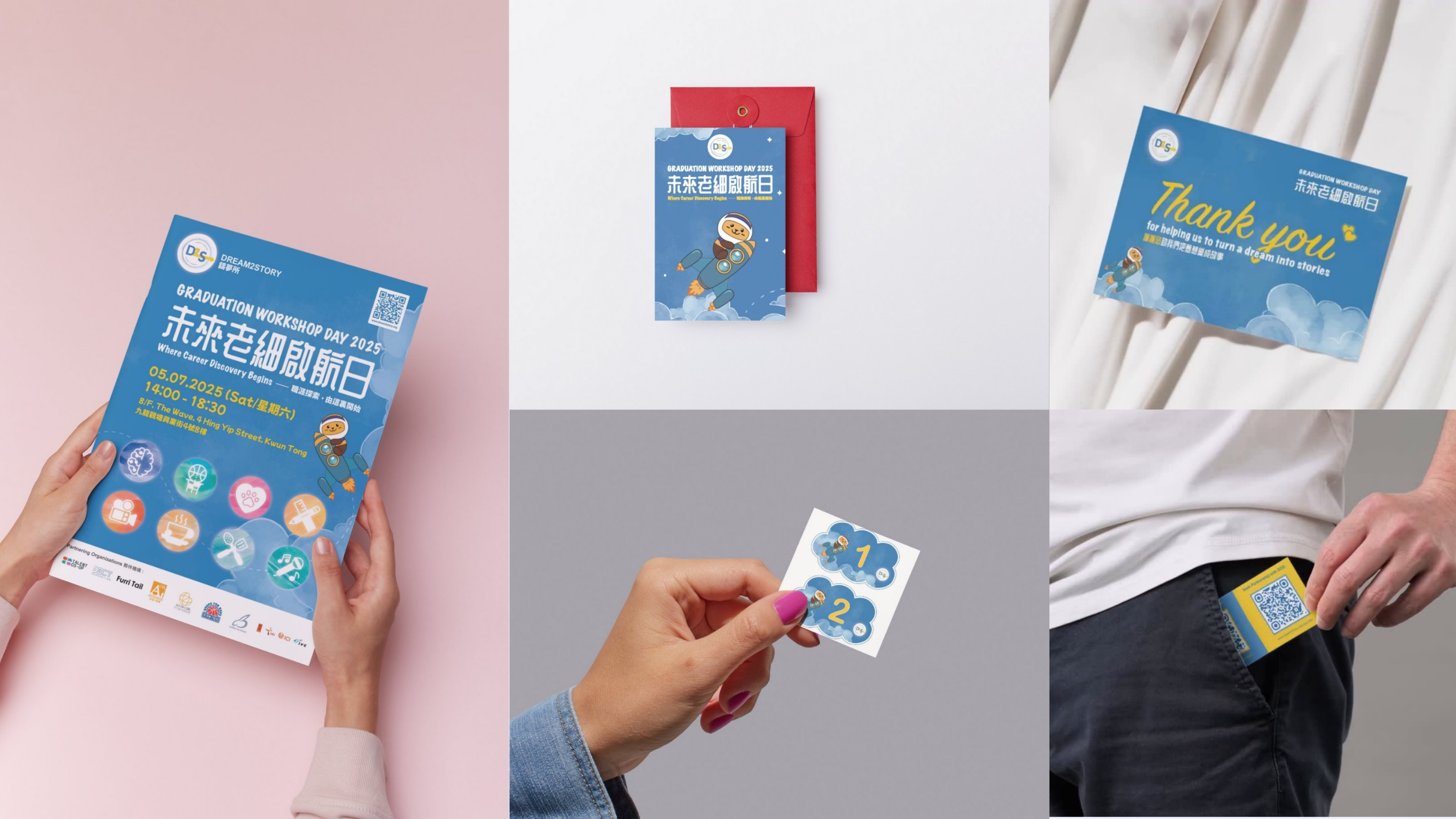
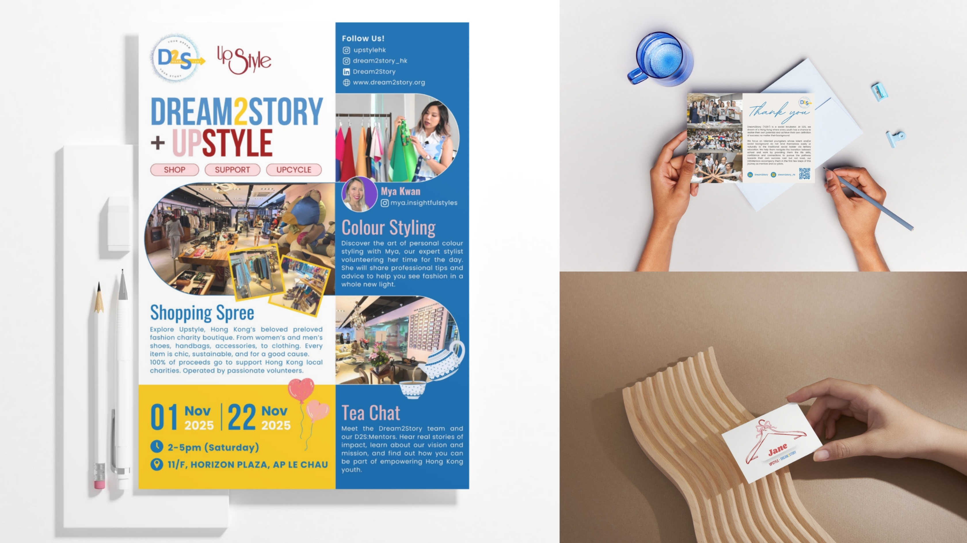
I led the visual creation for the organisation’s major programme event—a graduation workshop involving over 200 participants. Inspired by student-friendly communication styles, I designed a comic-style proceedings booklet using AI-generated visual elements blended with original layout direction. Alongside the booklet, I developed event posters, name badges, thank-you cards, and souvenir materials, creating a cohesive identity from pre-event promotion to on-site experience.
I also produced promotional visuals for fundraising activities, including the Uptyle x Dream2Story charity collaboration. This campaign required social media assets, printed materials, postcards, and eDM layouts, all designed to attract participation and drive awareness of Dream2Story’s mission.
Pitching Materials for Institutional Growth
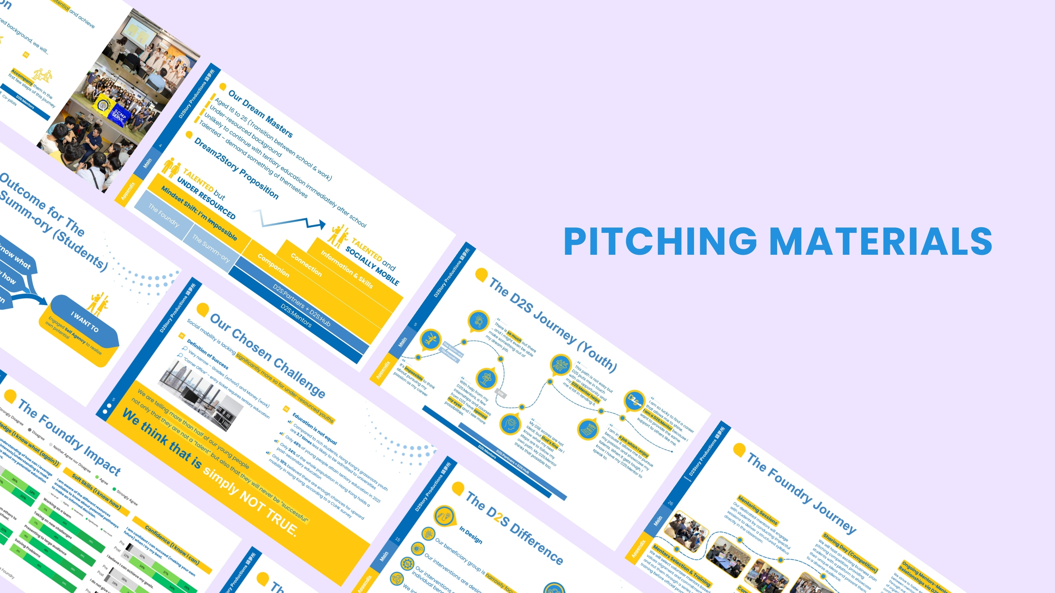
For an NGO, strong communication tools are critical when addressing donors, CSR departments, potential mentors, and strategic partners. I redesigned the organisation’s pitching deck to articulate key narratives more clearly—our mission, challenge areas, programme structure, impact data, and success cases. The updated deck was used across investor meetings, partnership discussions, and most notably at Dream2Story’s booth at the Rethink Sustainability Expo.To support this, I also designed a promotional brochure summarising key services, impacts, and future mission. The visual system was aligned with the newly refined brand direction, enabling the organisation to present itself with clarity and professionalism.
Impact Report & Annual Report Design
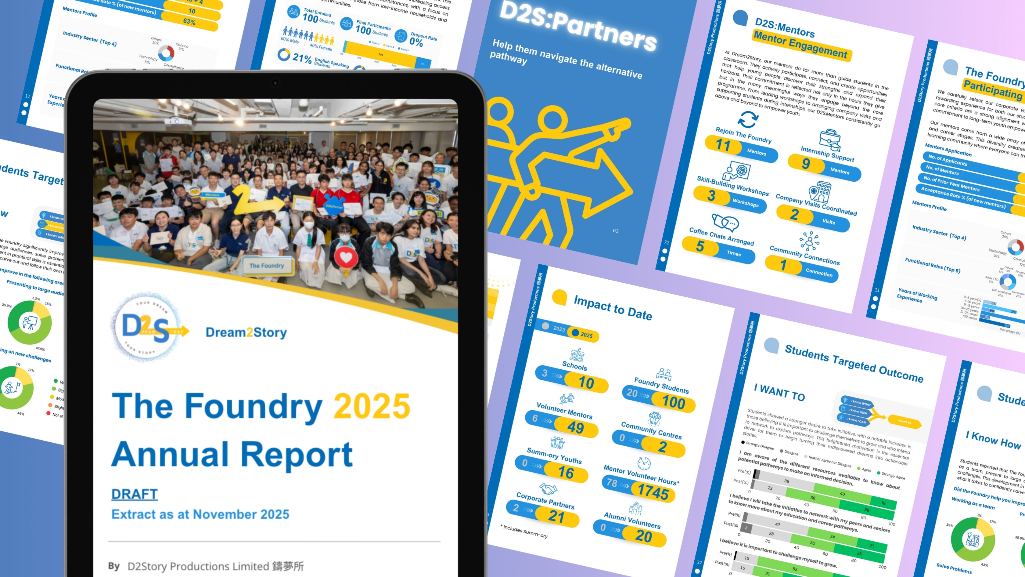
I contributed to the development and visual presentation of Dream2Story’s impact and annual reports—essential documents used for accountability and fundraising communication. My focus was on designing layouts that made complex stories easier to digest, showcasing impact numbers, participant stories, programme milestones, and year-on-year progress.By building a clean visual hierarchy, the reports served both as documentation and marketing touchpoints, supporting donor retention and strengthening institutional confidence in the organisation’s outcomes.
Challenge
The original website lacked visual hierarchy and failed to communicate JCP’s unique positioning and collaborative philosophy. The dense blocks of text and outdated layout posed challenges for user engagement, especially for first-time visitors unfamiliar with value methodology or collaborative contracting. A key challenge was distilling decades of professional expertise into digestible, audience-friendly content while preserving the company’s depth and professionalism.
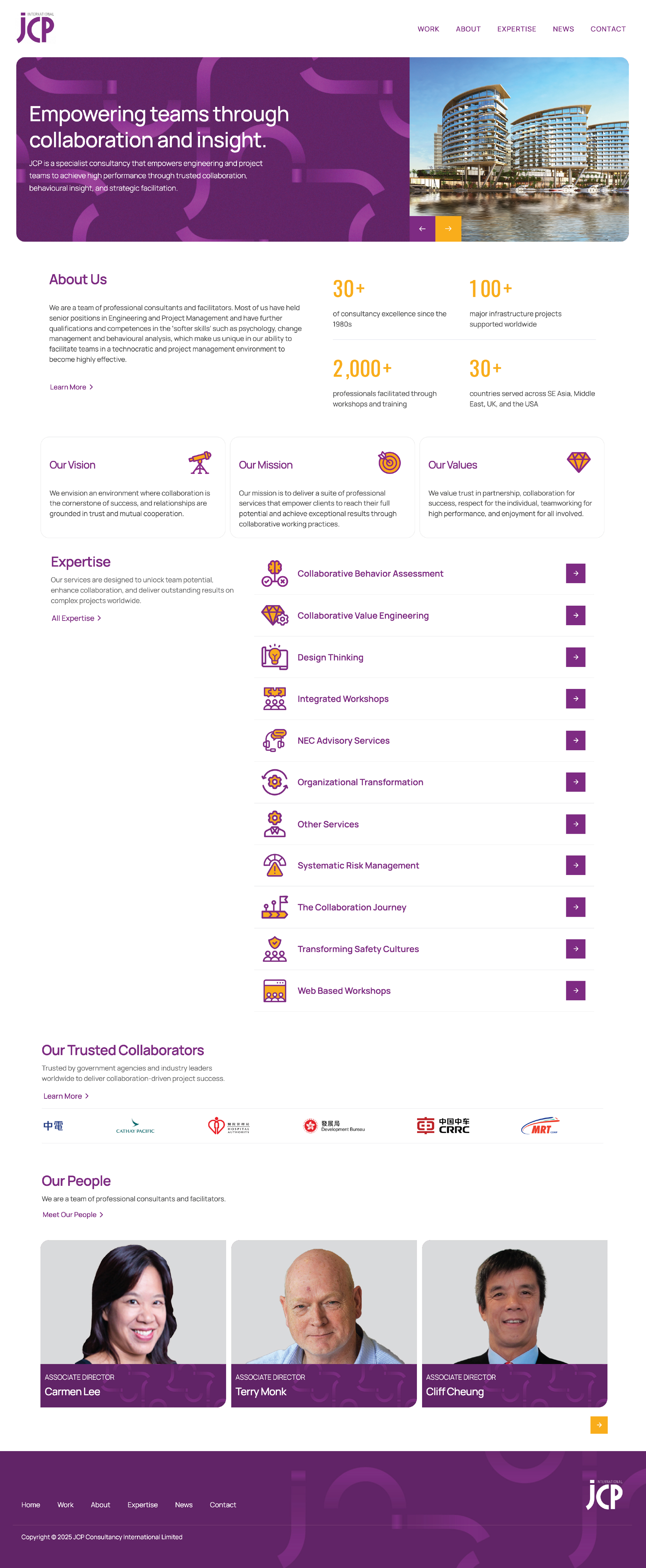
Design Concept
The design concept focused on clarity, trust, and collaboration. A soft, minimal colour palette paired with generous white space reflects JCP’s calm, strategic approach to consultancy. We introduced modular layouts, subtle animations, and iconography to visually represent abstract ideas like team alignment, mindset change, and project integration. Content was restructured to guide users through JCP’s services and process journey, with emphasis on storytelling and real-world impact.
Event Logo Concept: “30 × Infinity × HKIVM Silhouette”
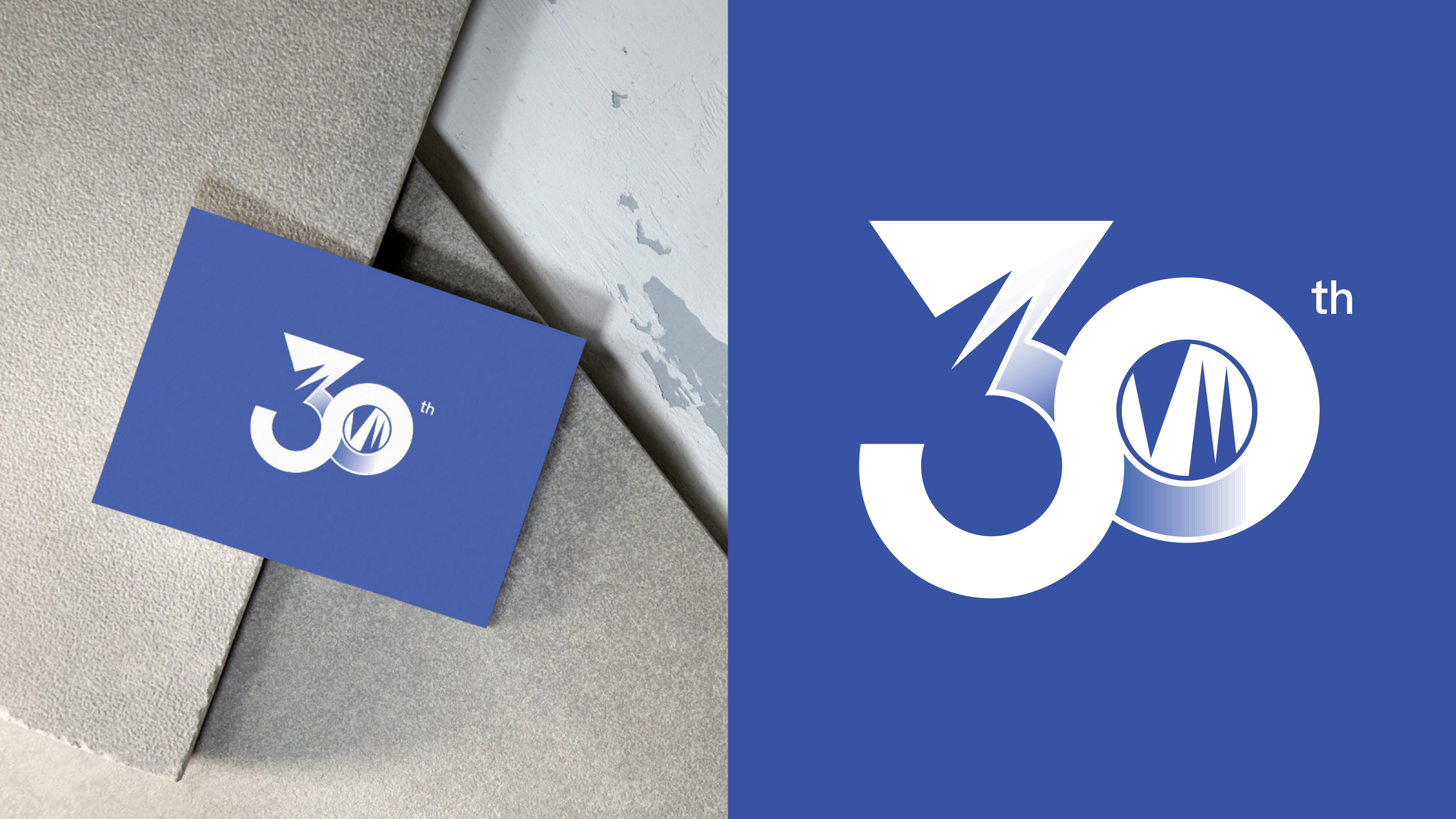
To commemorate HKIVM’s 30th anniversary, I designed a celebratory mark that merges the number “30” with the form of an infinity loop, symbolising sustainability, continuity, and the institute’s long-term commitment to advancing value methodology. Within the zero, I integrated the iconic M-shaped peak from HKIVM’s official logo to ensure brand continuity and recognition. This combination created a meaningful and heritage-consistent mark that communicates “30 years of foundation, infinite years of advancement,” representing both legacy and future ambition.
Key Visual Design Concept
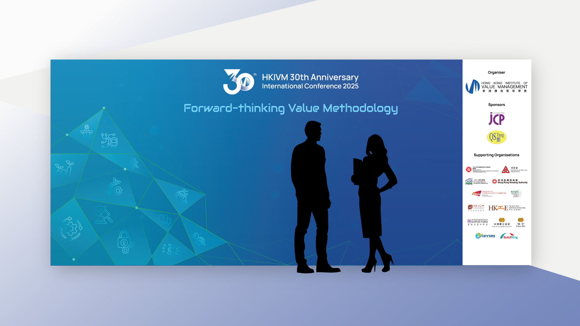
The key visual was developed to express the conference’s focus on forward-thinking, sustainability, and innovation. A futuristic gradient palette of teal, blue, and green forms the foundation, representing environmental responsibility, social harmony, governance, professionalism, and academic credibility. Geometric network elements—including polygonal meshes and linear connections—symbolise system thinking, digital transformation, and the evolving nature of value methodology. Subtle ESG-related iconography is integrated into the background to reinforce thematic relevance without overwhelming content. A clean layout structure ensures clarity, readability, and a professional tone suitable for international audiences and government or industry participants.
Flyers and Programme

Proceedings

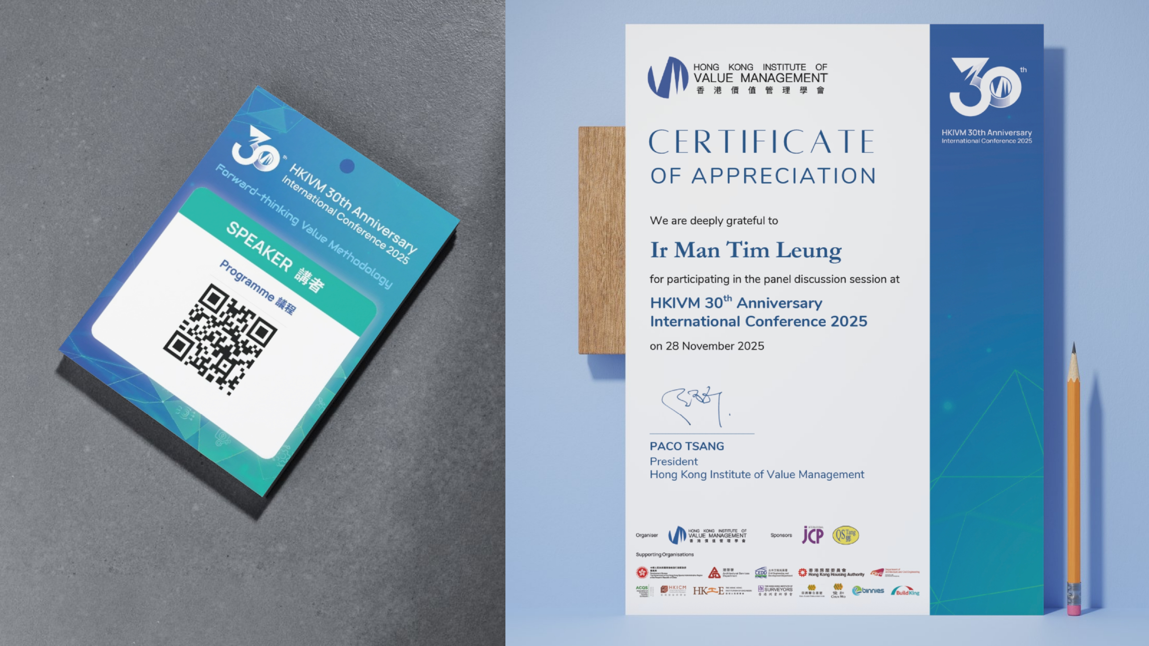
Certificates and Name badges
Business Card Design Concept

HKIVM also commissioned a refreshed business card design for council members. To distinguish the organisation from typical corporate formats, I introduced an arch-shaped silhouette symbolising a gateway to knowledge and structural integrity—reflecting both engineering and value methodology foundations. The design features a strong HKIVM blue field, a bold bilingual layout, and prominent logo placement. The modern shape adds a layer of creativity while retaining professionalism, aligning with HKIVM’s identity as a leading authority in promoting value management in Hong Kong. The result is a distinctive yet appropriate representation of the institute’s forward-thinking vision.
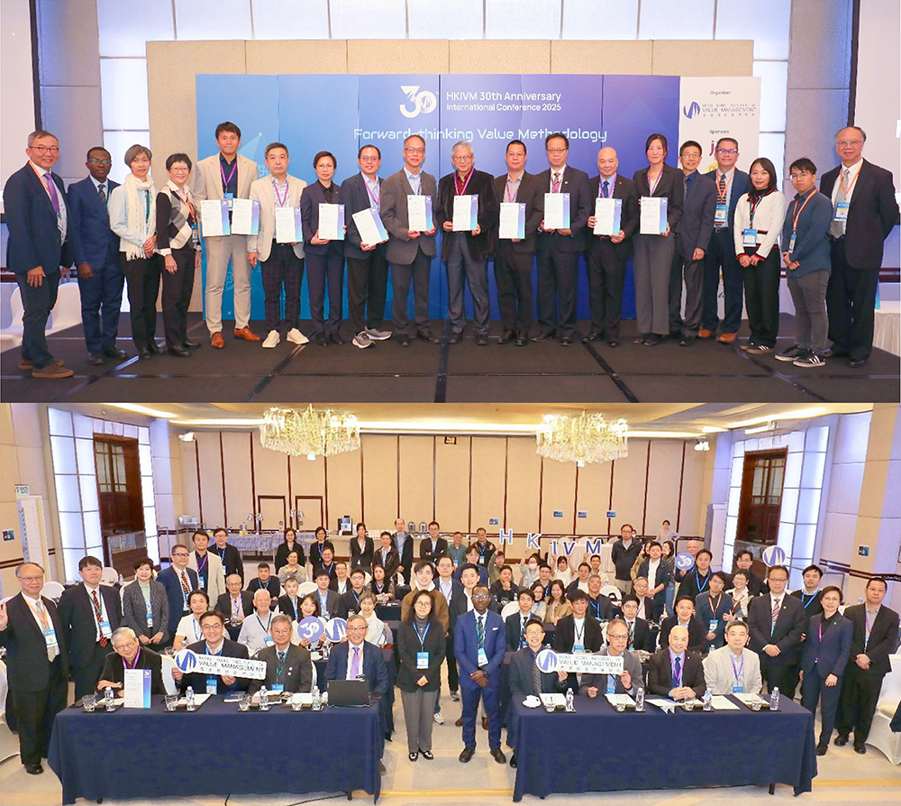
Event Highlights


Color Palette

Fonts

Interactive

Site Map

Responsive
Color Palette

Fonts

Interactive


Challenge
The original website lacked visual hierarchy and failed to communicate JCP’s unique positioning and collaborative philosophy. The dense blocks of text and outdated layout posed challenges for user engagement, especially for first-time visitors unfamiliar with value methodology or collaborative contracting. A key challenge was distilling decades of professional expertise into digestible, audience-friendly content while preserving the company’s depth and professionalism.
Design Concept
The design concept focused on clarity, trust, and collaboration. A soft, minimal colour palette paired with generous white space reflects JCP’s calm, strategic approach to consultancy. We introduced modular layouts, subtle animations, and iconography to visually represent abstract ideas like team alignment, mindset change, and project integration. Content was restructured to guide users through JCP’s services and process journey, with emphasis on storytelling and real-world impact.
Program Opening - StoryBoard

Framework

Challenge
The original website lacked visual hierarchy and failed to communicate JCP’s unique positioning and collaborative philosophy. The dense blocks of text and outdated layout posed challenges for user engagement, especially for first-time visitors unfamiliar with value methodology or collaborative contracting. A key challenge was distilling decades of professional expertise into digestible, audience-friendly content while preserving the company’s depth and professionalism.
Design Concept
The design concept focused on clarity, trust, and collaboration. A soft, minimal colour palette paired with generous white space reflects JCP’s calm, strategic approach to consultancy. We introduced modular layouts, subtle animations, and iconography to visually represent abstract ideas like team alignment, mindset change, and project integration. Content was restructured to guide users through JCP’s services and process journey, with emphasis on storytelling and real-world impact.
Color Palette

Fonts

Logo

Website

Challenge
The original website lacked visual hierarchy and failed to communicate JCP’s unique positioning and collaborative philosophy. The dense blocks of text and outdated layout posed challenges for user engagement, especially for first-time visitors unfamiliar with value methodology or collaborative contracting. A key challenge was distilling decades of professional expertise into digestible, audience-friendly content while preserving the company’s depth and professionalism.
Design Concept
The design concept focused on clarity, trust, and collaboration. A soft, minimal colour palette paired with generous white space reflects JCP’s calm, strategic approach to consultancy. We introduced modular layouts, subtle animations, and iconography to visually represent abstract ideas like team alignment, mindset change, and project integration. Content was restructured to guide users through JCP’s services and process journey, with emphasis on storytelling and real-world impact.
Color Palette

Fonts

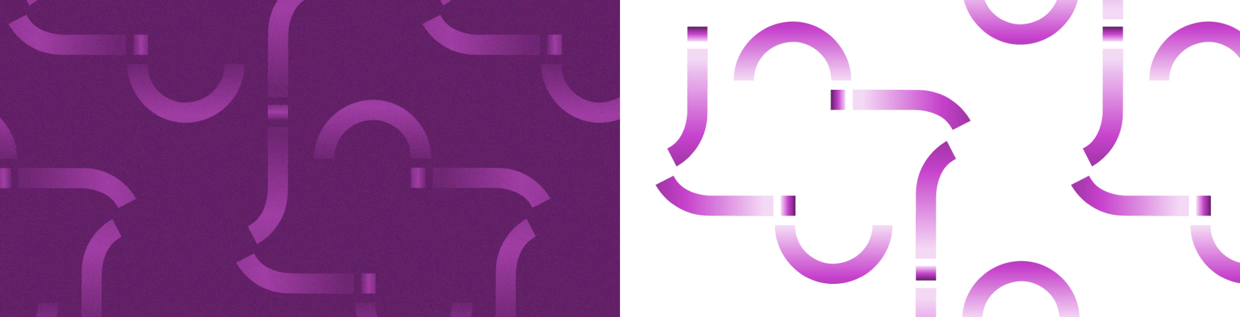
Pattern
Logo
Website
Challenge
The original website lacked visual hierarchy and failed to communicate JCP’s unique positioning and collaborative philosophy. The dense blocks of text and outdated layout posed challenges for user engagement, especially for first-time visitors unfamiliar with value methodology or collaborative contracting. A key challenge was distilling decades of professional expertise into digestible, audience-friendly content while preserving the company’s depth and professionalism.
Design Concept
The design concept focused on clarity, trust, and collaboration. A soft, minimal colour palette paired with generous white space reflects JCP’s calm, strategic approach to consultancy. We introduced modular layouts, subtle animations, and iconography to visually represent abstract ideas like team alignment, mindset change, and project integration. Content was restructured to guide users through JCP’s services and process journey, with emphasis on storytelling and real-world impact.
Key Visual

E-booklet

EDM

Banners

Newspaper

Photo Backdrop


Signages, Badges

LED Motion Graphic


Challenge
The original website lacked visual hierarchy and failed to communicate JCP’s unique positioning and collaborative philosophy. The dense blocks of text and outdated layout posed challenges for user engagement, especially for first-time visitors unfamiliar with value methodology or collaborative contracting. A key challenge was distilling decades of professional expertise into digestible, audience-friendly content while preserving the company’s depth and professionalism.
Design Concept
The design concept focused on clarity, trust, and collaboration. A soft, minimal colour palette paired with generous white space reflects JCP’s calm, strategic approach to consultancy. We introduced modular layouts, subtle animations, and iconography to visually represent abstract ideas like team alignment, mindset change, and project integration. Content was restructured to guide users through JCP’s services and process journey, with emphasis on storytelling and real-world impact.
Key Visual
Booklet

EDM
Banners

Newspaper

Photo Backdrop

Challenge
The original website lacked visual hierarchy and failed to communicate JCP’s unique positioning and collaborative philosophy. The dense blocks of text and outdated layout posed challenges for user engagement, especially for first-time visitors unfamiliar with value methodology or collaborative contracting. A key challenge was distilling decades of professional expertise into digestible, audience-friendly content while preserving the company’s depth and professionalism.
Design Concept
The design concept focused on clarity, trust, and collaboration. A soft, minimal colour palette paired with generous white space reflects JCP’s calm, strategic approach to consultancy. We introduced modular layouts, subtle animations, and iconography to visually represent abstract ideas like team alignment, mindset change, and project integration. Content was restructured to guide users through JCP’s services and process journey, with emphasis on storytelling and real-world impact.
Key Visual
Booklet

Website

Newspaper

EDM

Campaign Highlight
Challenge
The original website lacked visual hierarchy and failed to communicate JCP’s unique positioning and collaborative philosophy. The dense blocks of text and outdated layout posed challenges for user engagement, especially for first-time visitors unfamiliar with value methodology or collaborative contracting. A key challenge was distilling decades of professional expertise into digestible, audience-friendly content while preserving the company’s depth and professionalism.
Design Concept
The design concept focused on clarity, trust, and collaboration. A soft, minimal colour palette paired with generous white space reflects JCP’s calm, strategic approach to consultancy. We introduced modular layouts, subtle animations, and iconography to visually represent abstract ideas like team alignment, mindset change, and project integration. Content was restructured to guide users through JCP’s services and process journey, with emphasis on storytelling and real-world impact.
Color Palette

Fonts

Buttons

Website
